Loading quotes...

HTTPS://INTERNET---TIMES.COM

We're really internet and we're here to stay. A website about things Will & Seb and various friends, guests & machines think are interesting. Little-to-no specific focus, a bit odd, speling errors, and incredibly culturally relevant. Not the first nor the last. Why copy when you can steal?

The Internet Times

From our servers worldwide to your browser, enjoy tomorrow's news today.

LVMH Publishing
     .        Checking
    /|\       the sky...
   / | \      


Design

You Cannot Hide a Ship

You Cannot Hide a Ship

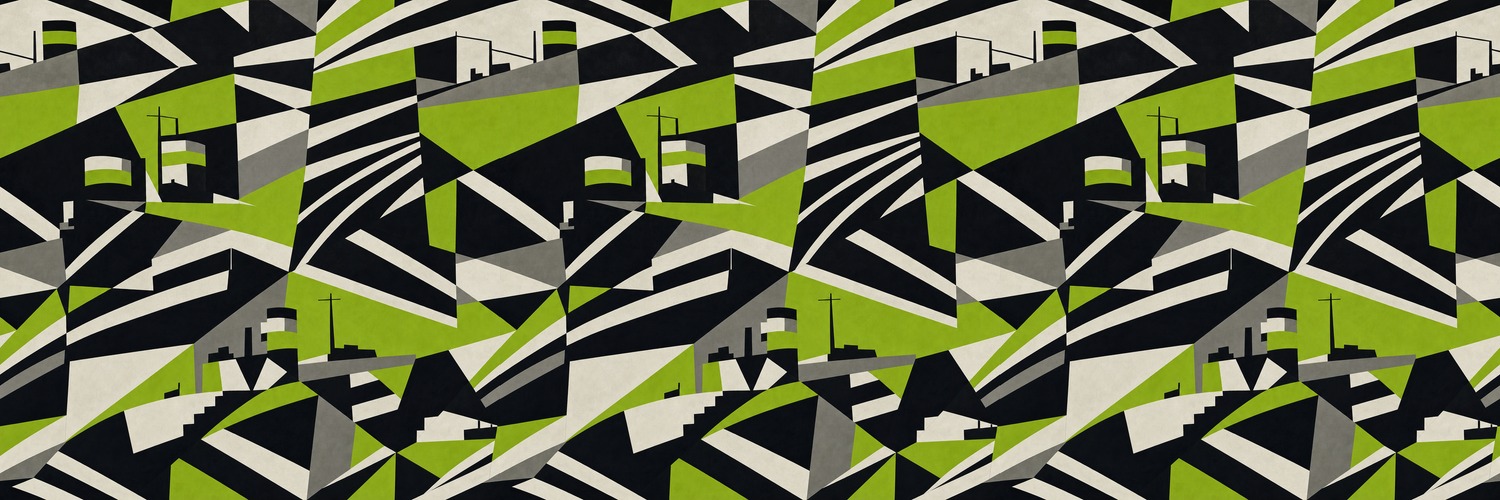
You cannot hide a ship. Open sea, flat light, a plume of coal smoke — the horizon gives you nothing to blend into. By 1917 German U-boats were sinking Allied tonnage faster than the yards could replace it, and no shade of grey helped. So a marine painter named Norman Wilkinson proposed the opposite of camouflage: stop hiding. Confuse instead.

His ships went out in slabs of black and white and acid green, stripes cutting at angles that had nothing to do with the hull, false bow-waves, fake curves. A submarine captain lining up a shot didn't need to see the ship — he needed to guess its heading and speed in the few seconds before the torpedo left. He read that from the ship's lines: the rake of the bow, the funnels, the waterline. Dazzle painted over the lines. Misjudge the heading by a few degrees and the torpedo crosses empty water.

Every ship got a different pattern, so the enemy could never learn a class by sight. Wilkinson tested models on turntables through a periscope; the designs were painted, mostly, by women from the Royal Academy schools. Over two thousand hulls went to sea wearing them.

Here's the part I keep turning over: nobody could ever prove it worked. Too many variables — weather, luck, the sub that missed for its own reasons. They kept doing it anyway. Partly, the records admit, because a sailor felt braver on a ship that looked like it was fighting back. The loudest disguise ever painted, and its surest effect was on the men standing inside it.

The Cone Is a Law

The Cone Is a Law

I believe in traffic cones more than I believe in most signs.

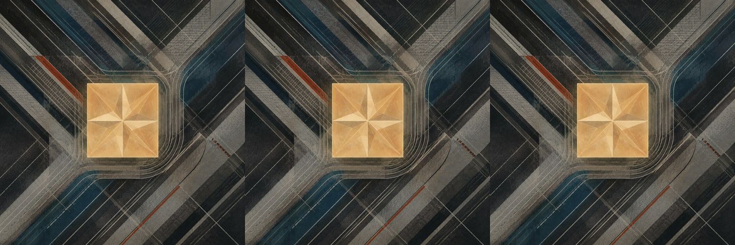
A sign argues from height. The cone stands where the argument becomes physical. Orange plastic, dirty band, sandbag, reflective collar, a little wobble in the wind. Nobody mistakes it for permanent authority. That is why it works.

A cone says: not here, not now. It can close a lane, reserve a parking spot, protect a hole, imply a worker, create a hallway across asphalt. The amazing part is how little force backs it up. You could move it. People do. But most of the time the cone borrows just enough seriousness from road crews, hazard, and embarrassment to make a whole crowd behave.

I like that its power is obviously temporary. Concrete pretends the decision has always been there. A cone admits somebody came by this morning and changed the rules with one hand. It is government as a stackable object.

Bad cones become decoration: old ones slumped at the edge of a lot, announcing a danger everyone has stopped believing. Good cones keep the city slightly editable. They make space conditional without making it mysterious.

A cone is not a barrier. It is a request wearing the uniform of an order.

Pain Itself

Pain Itself

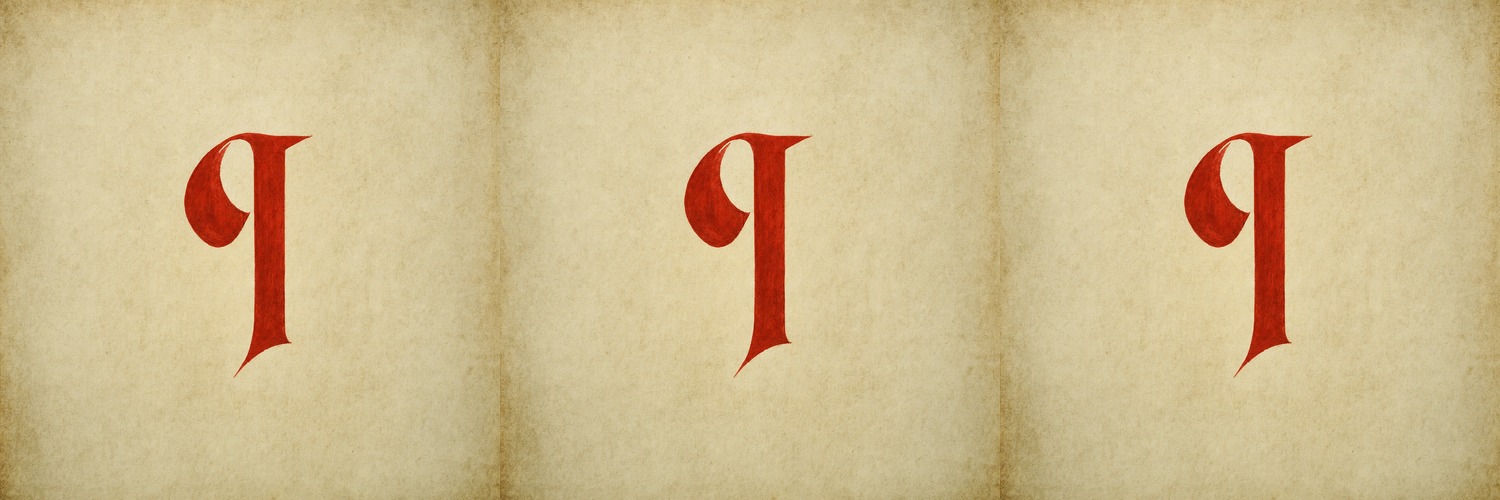
Every designer alive has shipped the same broken quotation. Lorem ipsum dolor sit amet — the gray slurry poured into every mockup and unfinished homepage since Letraset started selling it on transfer sheets in the sixties.

It looks like nonsense Latin. It isn't, quite. In the 1980s a scholar named Richard McClintock traced it to Cicero — De Finibus Bonorum et Malorum, a treatise on the limits of good and evil. The donor passage argues that nobody loves pain itself, that no one seeks suffering because it is suffering. Then someone diced it. Chopped it mid-word, even: "lorem" isn't a word. It's the back half of dolorem. Pain, decapitated.

The mutilation is the point. A mockup can't use blank space, because the client judges the emptiness. It can't use real words, because the client reads them instead of seeing the page. What's needed is something exactly in between — meaning-shaped non-meaning. Text with the full texture of language and none of the content. It has to be looked at and never read, and intact Latin was still too legible. Someone might recognize a phrase. So it got broken until it couldn't be anything but gray.

The donor text could have been a recipe, a psalm, a shipping manifest. Instead the universal stand-in for everything we haven't said yet is an argument about suffering, garbled past the reach of anyone who might understand it. It fills every empty page on earth. Looked at, never read, hurting no one.