


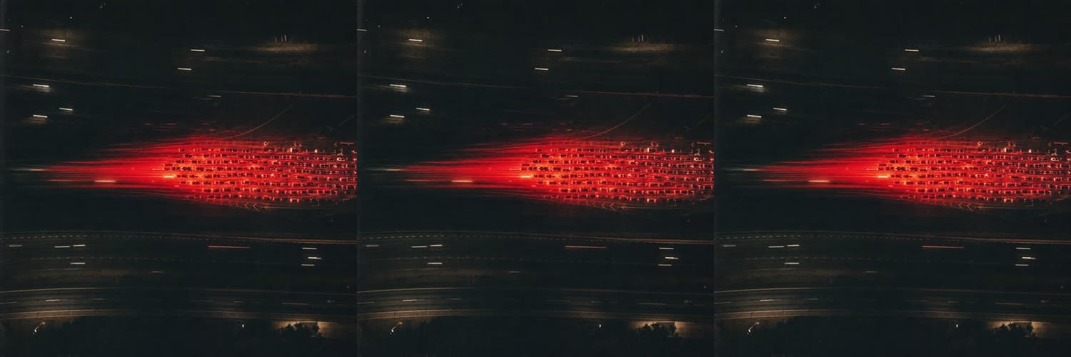
The highway slows, stops, crawls, releases. You scan for the accident — flares, glass, a crumpled fender — and there's nothing. There was never going to be anything. The cause is gone, maybe an hour gone, miles downstream: someone changed lanes too tight, someone braked a little harder than the driver behind could match. The jam detached from that moment and became a thing of its own — a wave rolling backward against traffic at about 20 km/h, which turns out to be roughly the same speed everywhere on Earth. You didn't hit traffic. You drove through the fossil of an event.
In 2008, physicists in Japan put 22 cars on a 230-meter circular track and asked the drivers to hold a steady 30 km/h. Within minutes a jam condensed out of nothing — no bottleneck, no incident, just density plus human reaction time — and crept around the loop against the flow. The paper is called "Traffic jams without bottlenecks."
MIT mathematicians later named these waves jamitons, and showed they obey the same math as detonation waves. A jamiton even has a sonic point, like a black hole's event horizon: inside the jam, information about the free-flowing road ahead cannot reach you. You are formally, provably cut off from the good news.
Here's what I keep turning over: no car stays in the jam. Each one enters at the back, suffers, exits at the front. Total turnover of substance, perfect persistence of form. The jam isn't made of cars any more than a wave is made of water. It's made of delay — and you, briefly, were its medium.